Thursday, November 19, 2009

Final Project - Human: Nature

“Miscommunications”
This series of photos illustrate how one may infer the content of the previous person differently and thus react accordingly.
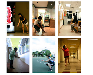

This idea is banking on the fact that people do misinterpret, misunderstand and miscommunicate easily. This was proven when the next person I approached inferred the action of the previous person not as what the person intended, and thus pose for the next frame in ‘reaction’ to the previous person’s action. It is interesting to see how the context changes along the way. It would have been more fun if the photos continue a few more, but I could only afford 6 (just nice).

This is the project that I took the most pride in despite the challenges I faced. This is because I really love conceptual art especially those that are spontaneous and involves the public, and I can’t believe I get to experience a slight taste of it myself. Even though I felt awkward and weird to approach strangers and having to take up their time listening to me explaining my concept, there was satisfaction each time I did it. I even felt awkward for them having to freeze in their pose for my camera with people staring. However, the higher the difficulty, the greater was the satisfaction. Haha. And I was doing this all alone, going around and spotting cleaners, vendors, students doing sports etc.

Assignment Five: Emotions Capture

Calm

Reflective

Gloomy

Aspiring

Abandoned

This is quite a headache too. I had thought that my photos were pretty fitting to the emotions described but after the feedback given during tutorial, I realised they were pretty shallow. The photos do not have a context that further portrays the emotion stated but merely used angles. For example, if I were to shoot anything from a low angle with the skies as background, it can be termed as “aspiring”. I will continue to mull over the thing about context…

Melancholic

Aspiring

Abandoned

‘Abandoned’ was the photo I was most satisfied with from the first try. I tried to take photos invoking stronger emotions in the viewers but I was limited by the props I have on hand and the time factor to get them. I still chose ‘aspiring’ in the end because as I asked around my friends for opinions, at least they had some emotions for this photo than for the previous photos ‘gloomy’ and ‘calm’ and ‘reflective’. Took a new photo ‘melancholic’...just hope that it is not too similar to ‘abandoned’..

Assignment Four: False Reality (Surrealism)

The biggest and longest headache among all the assignments. Despite having a week of recess week to brainstorm for ideas, what I came up with is still dissatisfactory, but I took the photos anyway and to hear what my classmates would have to say. I had wanted to fill up the spaces around the cubic wall but did not realise how out-of-place the gate looks in the whole photo until it was mentioned during class.


Ever since Jing asked me considering David Hockney’s works, I began to take interest and like it myself. I thought of doing photo montage which is kind a trademark for David’s works, but still I need a concept for that too. So I continued to brainstorm and brainstorm, even up to the week of submission…that is why I said it a major headache. To be honest, the idea was only conceived one day before the submission of the port folio and I would say I pretty like the feel of the end result, though it isn’t a complex one or have a strong concept behind.


I named it "Break of dawn". It's something like the rooster is the one that witness the transition from night to day, waking the households up with its voice.

Assignment Three: high/low key, zoom, perspective, close-up

I could not understand the technical aspects of high key and low key, and the meaning of perspective for quite some time, especially about the metering..!

High key
I think is quite okay...

Low key
CANNOT MAKE IT.


Zoom shot
Never knew zoom shots are created like this. It is not hard to achieve a good zoom effect if you’re using a tripod stand, but if everybody can easily produce a zoom shot, what makes your zoom shot more interesting than the others’? I tried playing around with different methods of zooming, for example for the teletext screen, I think I did something like zoom in/out, span a little to the left, and zoom out/in again with the click of the shutter. Not sure if it qualifies as a zoom shot or am I trying too hard. Haha. I find it safer with the danger sign. And it seems like Jing is rather particular about the straightness of the lines in the zooming, I’ll probably retake the photo.

Perspective
Pardon me for the blurriness in the foreground, but this picture does stretches very 'far' right?

Close-up
I know this is a very safe shot to do (on fruits) but I don’t find it creative. And also, it is not really easy to take very sharp and clear close-up photos without having parts of the photo blurry due to the DOF.

(final photos)

(these are marbles that I have kept since young)


At last I am rather satisfied with my low key photo, albeit it being partially blurred inevitably. This assignment is the one with the highest number of photos that need not be retaken or have kept its subject.

Assignment Two: depth of field, shutter speed

Shallow depth of field
Composition is good but the focus was on the wrong area, only the hand but not the chess piece, which should be e main subject.

Deep depth of field
I really like this picture - very green plants and very nice sky. But after tutorial i realised that a good DOF should have three grounds: foreground, mid-ground, background. This has only the first and third.

I find taking shallow DOF much easier than deep DOF because you just need to keep one part of the photo in focus. I tried taking deep DOF but all of them ended up with a portion that is blur. I guess I have not gotten use to the manipulation of a DSLR yet.


Fast shutter speed

Slow shutter speed
Had my friends to help out quite a lot with these two shots for I can’t really produce the movement and take the shot at the same time. So I asked them to try out many different kinds of movements, like flipping page of a textbook, jumping, rolling chess pieces, spinning an umbrella etc.

Was glad to hear from Jing saying the SSS photo has a potential but it was underexpose. Yes, I admit that a lot of my photos are still badly exposed and not as sharp as it should be. I guess I need to familiarize myself with the DSLR more to figure out what degree of zoom and distance between the camera and object would produce the best picture quality.

(final photos)


During the last two weeks I managed to borrow a DSLR from my friend (in which I felt very awkward and hesitant to ask). Though it is only a Canon 350D which is an older model than what the school is loaning out, the prime lens that my friend has came as a surprise to me. Though it could not zoom at all, it has a wider aperture range than the normal lens, which was a asset to my taking of SDOF.

Retook my 'fast shutter speed' for a correct exposure n also to not have e unsightly spoon in the frame, meaning my friend got to stir vigorously and pull out the spoon fast, and I have to shoot fast as well. Created a 'splash' out of the glass, a pleasant surprise. And because I had to set the shutter speed to a very high speed to capture the freeze motion, it is very difficult to not have an underexposed photo despite setting to high compensation exposure and ISO. I resorted to using the flashlights of two handphones behind the glass of water and I was pleased with the result! It kind of has a “cooling” effect.

Assignment One: lines, pattern, shape, form, texture


One of the first places when I thought about lines is the ceiling of Millenia Walk. Jing commented that the area below (areas without the dynamic lines) is taking up too much proportion of the photo, which upon hearing I found to be quite true since this is a “lines” photo. I like the colours and the lines, and it could fit the bill if I crop the bottom part away, but I decided to look for less ‘obvious’ lines.


Realised that I have this cute little stool that is bright pink in colour and has heart-shaped holes which form…patterns. Had to take this when my family is asleep, switch off all lights and find a blank wall. This photo was not commented on during tutorial, but sadly I realised the shadow with heart-shaped holes cast on the wall is only seen on my laptop but when I uploaded it to Picasa, it’s just a piece of black.


Not too satisfied about this one. Yes they are shapes, but I feel that it’s too ‘obvious’.


This is the hardest to achieve among the five, and I see my classmates struggling with form too. It was only after tutorial that I could grasp the meaning of form and it was satisfying.


Don’t know why but my family keeps this little sponge thing that is so dried up that it looks like bread. I like its colour and texture, kinda cute.

This is the first assignment of this module, and I am doing it with great joy and excitement, expecting what is more to come. As I said, it was satisfying after tutorial because of the doubts cleared as to what kind of photos meet the five criteria. Felt excited to retake the photos after gaining a new perspective about them. (: And with the thing about being photos being “obvious”, I guess it would score high on creativity if it is one that people would have
not have noticed it could represent something (shape, pattern etc) but you did.

(final photos)


I retook pattern with a stronger light source and darker surrounding. And the good thing is now Jing has opened up the choice for some photo editing so I tweaked the contrast and brightness too. I also cropped out the sponge surface to emphasise more on its texture.

Friday, October 30, 2009

Class Ex C

How is documentary photography different from photojournalism?
.
To “document” means to record the details of an event, a process, etc (Cambridge Dictionary). The key word is record. The purpose of documentary photography (DP) is to let the photos elevate an understanding of a certain subject matter, usually a topic not being commonly thought about by the public or a facet of life not brought to light. It is like a form of storytelling using powerful visuals, whereby the photographer conveys this story he sees to viewers by capturing it within the camera’s viewfinder. It involves a series of photos, or a photo essay that are usually taken candid.
.
This portrayal would be more effective if the photographer has lived and been immersed in that culture or environment for a period of time long enough to feel more about the subject matter and identify with it more accurately. I believe that with the photographer’s deeper understanding, the emotions can better be reflected in photos he takes. However, the photos should remain objective and non-myopic.
Photojournalism (PJ), on the other hand, has different objective. It serves to tell news through images. Visuals are the first to capture reader’s attention in a piece of news, therefore they play an important role in supporting other news element to provide the context of the news. The photos should be able to “sell”.
.
Both DP and PJ require prior research on the subject matter. In comparison, PJ needs less time commitment on the scene than DP. A photojournalist may rush to a particular situation to cover the breaking news and leaves after a few shots. For most of the time, the news ends when that million-dollar moment has passed.
.
To me, DP is more like a project, whereas PJ is like a task. PJ is not meant so much as an art but rather, to meet the editor’s demand. However, we should also not discount the fact that photojournalists also take such great photos that they are exhibited in galleries and museums too, thus blurring the line between DP and PJ.
.
P.S. I couldnt load the podcast at all, thus reflection is not based on that but I took a pointer from its slides to write on.

Tuesday, October 20, 2009

Class Ex B

Group discussion


The above sketch is beautiful done by Ellen. It may look bizarre and weird at first glance (well, you can say all surrealistic works are like this) but if you take a look at the concept behind, it is actually something we all students can relate to. It shows a hand that belongs to a Uni student being drowned by tonnes and tonnes of books and papers (readings probably), and yet his hand is not giving up in reaching out to the A grade that all students would love to have. It kind of depicts the sad life of an Uni student, being too caught up with the paper chase. Have we become like him too?

Sunday, October 18, 2009

Class Ex A

This is a photo I would like to talk about, because I really like it. It's beautiful how the hunch of both women's backs are synchronised and their different distances from the photographer created such depth. The back of the woman in the background seems to fit nicely into the front of the woman in the foreground. In addition, I like how the shadow of the trees on the wall seems to be advancing out from the woman in the foreground. I feel that in overall this picture won my heart mainly due to its composition.


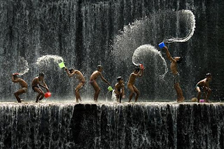
However, I would think this photo would be the overall winner instead. This bathing scene may be a common sight in Bali but how often can such a beautiful shot be captured, with the splashes of the four children caught in mid-air and all of which having a profile view. This photo just brings out the vibrancy and joy in those kids having fun playing with water.